09 Dec 2025 Why We Refreshed Our Look
For more than 60 years, Haynie has grown by staying true to our core values: trust, service, team, accountability, and growth. These values have guided every decision and shaped who we are. As we expand our services, teams, and impact, it has become clear that our visual identity should grow with us.
Today, our refreshed brand unites Haynie CPAs, Haynie Wealth, Haynie IT, and the Haynie Foundation under one clear, cohesive mark, one that reflects our history while looking boldly toward the future.
Strength & Precision
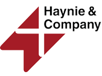
Our new geometric design conveys structure, accuracy, and reliability. These qualities define accounting and advisory work. It signals that Haynie is built on trust, strong foundations, and proven expertise.
Forward Progress
The angled elements create a sense of movement and momentum. They represent growth and a forward-looking mindset. This reflects our ongoing commitment to helping clients, people, and communities move ahead with clarity and confidence.
Unity & Teamwork
The logo is made of distinct shapes that come together seamlessly. This mirrors how our diverse offices and service lines collaborate as One Firm. We work together to deliver exceptional service and support. It symbolizes the strength of our Team value.
The Plus Factor
At the center of the mark is a subtle but intentional plus sign. It reflects our promise to always deliver more: more service, accountability, growth, and trust. It represents positivity, partnership, and the value we add to every client and community relationship.
Our refreshed look marks a new and exciting chapter for Haynie. While our appearance has evolved, our mission remains the same: to serve our clients, support our people, and strengthen our communities. We are proud of where we have been and even more excited for where we are headed as we continue to grow together.
Contact Us
Have a question or ready to start a conversation? We’re here to help.

